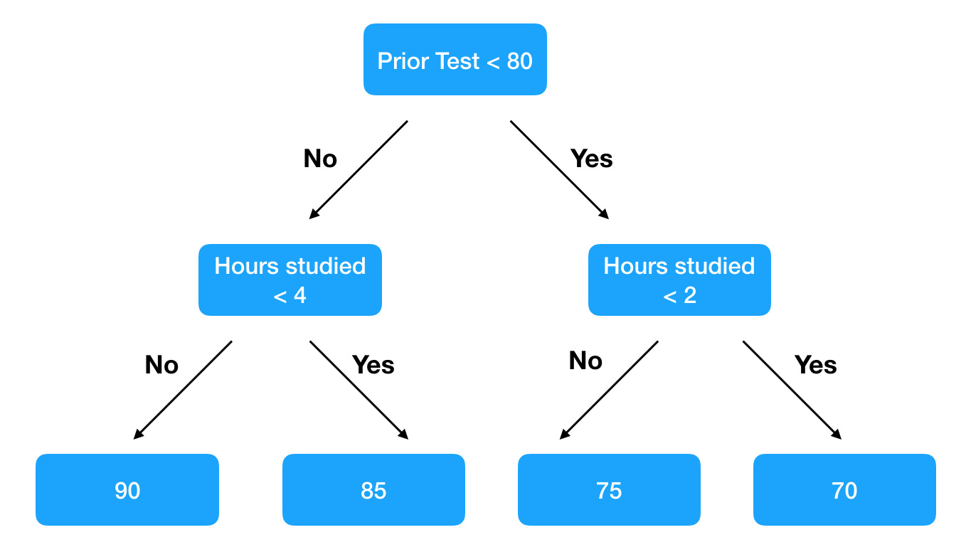
Decision tree ensembles, specifically gradient boosted methods, are a powerful and easy-to-use machine learning technique for making predictions. They work by leveraging a large number of simple decision trees. For example if we are trying to predict how students will score on an upcoming test, one decision tree might look like this.

A single tree captures some information but is insufficient to make an accurate prediction. Only when we aggregate the responses of hundreds of trees, do the predictions become robust. I liken it to guessing how many candies are in a jar. One person’s guess might be far off, but the average of 1,000 guesses is usually a good approximation.
An issue with decision tree ensembles is that it’s not clear what relationships the model has learned. One can visualize one tree (XGBoost has a plot_tree method) but one tree doesn’t tell us much. Which brings us to the awesome ELI5 package. ELI5, an acronym for explain like I’m five, offers ways to visualize and understand how your model is making predictions. Specifically, for a given observation, it can tell you the impact of each feature on the prediction. It works by looking at how the prediction changes across all of the trees based on a specific feature. Let’s consider one student who studied for 5 hours. ELI5 might tell us that across all of the trees, having a value of 5 for hours studied has a +10 impact on the prediction for the upcoming test. When we extend this to a large number of observations, we can understand the relationships the model is learning.
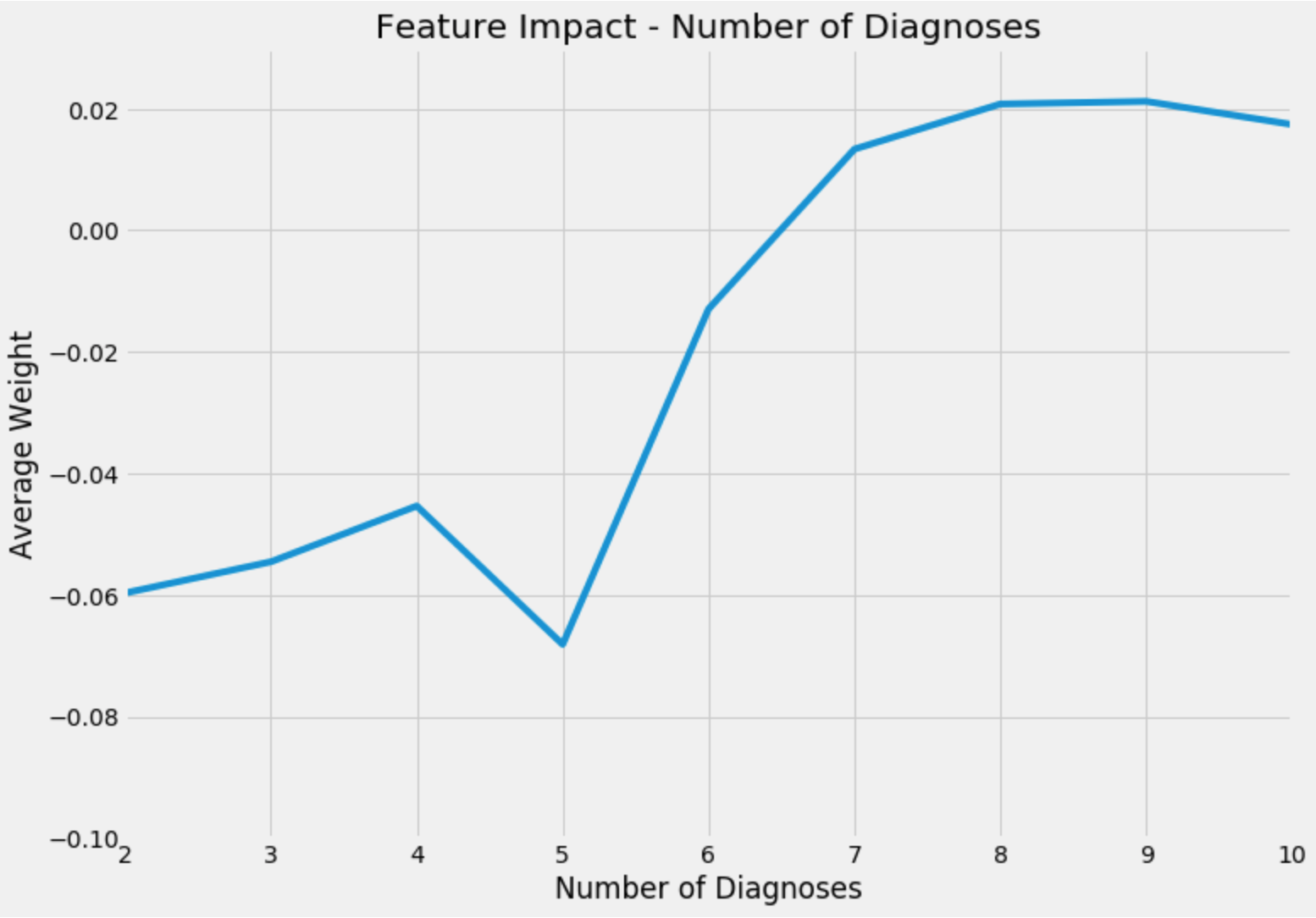
Using a dataset on hospital readmission, I want to walk through an example. The dataset is described in detail here but essentially there are features pertaining to a hospital visit such as the number of diagnoses made, length of visit, and how many procedures were performed, and the target variable is if they were readmitted to the hospital. I trained an XGBoost model and ran ELI5’s explain_prediction method on 2,000 observations to build a dataset of feature values and their impact on predictions. After filtering for a specific feature and averaging weights across feature values, we can get an idea of the relationship that the model has learned. A positive weight is related to a higher predicted probability of readmission. This graphic shows the average weight for observations with between 2 and 10 diagnoses entered into the system during the patient’s visit.

Up until 5 diagnoses, the weight is relatively consistent and negative so it contributes to a lower chance of being readmitted. But if an observation has more than 6 diagnoses, this feature has a positive weight. And just as the difference between 3, 4 and 5 diagnoses on the low end is muted, there is little difference between 7, 8 or 9 diagnoses. Intuitively this makes sense. Decision trees are great for learning non-linear relationships, and with this method, we can visualize what the model learned!
The code is on my GitHub.